How to set up the Accordion block
In short
The Accordion block shows up to five panels, each with a title buyers click to reveal its text. Add the block, add panels with a Panel Title and Panel Content, then choose which panel starts open, whether several can be open at once, and the toggle icon. Save, then place it in the checkout editor.
Category
Layout & Content
Plan
Advanced & Deluxe
Where it shows
Shopify checkout
Setup
No code, ~5 minutes
✓ Applies to
- Advanced and Deluxe plans
- Shopify Plus checkout
- Any checkout position: body, after the header, or around the delivery address
✕ Doesn't apply to
- Links, images or formatting inside panels. Panel content is plain text
- More than five panels in one accordion
- Thank-you and order status pages
What the Accordion block does
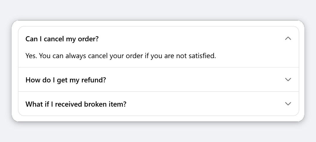
The block shows a bordered list of panels in checkout. Each panel has a bold title and a toggle icon. Buyers click a title to show or hide the text underneath. It answers common questions without filling the page.
When to use it
- Answer checkout FAQs, such as delivery times, returns or how gift cards work.
- Keep long policy text tucked away until a buyer wants it.
- Explain options next to the fields they relate to, such as what each delivery method includes.
Before you start
- Write your questions and answers. Keep each answer short: panel content is plain text with no formatting.
Set it up
- In Checkout Ninja, go to Blocks and click Create New Block. Then click Start Fresh, or open an existing block you want to add it to.
- Click Add block and choose Accordion.
- Under Accordion Panels, click Add new panel.
- Enter the Panel Title (required) and the Panel Content.
- Repeat for up to five panels.
- Choose the Default Open Panel, or None (All Closed).
- (Optional) Turn on Allow Multiple Panels Open, change the Toggle Icon, or turn off Show Dividers.
- Click Done. Check that Status is Active, then click Save and copy the Block ID.
- Click Open Checkout Editor. Add the Custom Block app block where you want the accordion, paste the Block ID and save.
Settings reference
Accordion Panels
Up to five panels. Each has:
| Setting | What it does | Default |
|---|---|---|
| Panel Title | Bold title buyers click to open the panel. Required. | Empty |
| Panel Content | Plain text shown when the panel is open. | Empty |
Behaviour and style
| Setting | What it does | Default |
|---|---|---|
| Default Open Panel | Which panel is open when checkout loads: First to Fifth Panel, or None (All Closed). | First Panel |
| Allow Multiple Panels Open | Lets buyers keep several panels open. When off, opening one panel closes the others. | Off |
| Toggle Icon | Icon on the right of each title: Chevron, Plus/Minus or None. | Chevron |
| Show Dividers | Draws a line between panels. | On |
Verify it worked
- Open your checkout. The accordion shows your panel titles, with the default panel open.
- Click another title. It opens, and the previous panel closes unless Allow Multiple Panels Open is on.
Limitations
- Shopify Plus only for placement in the checkout steps. That’s a Shopify rule for all checkout apps.
- Five panels at most per Accordion block.
- Panel content is plain text: no links, lists, bold or images.
- Panels reset to the Default Open Panel each time checkout loads.
- The border, padding and text styles are fixed and follow your checkout branding.
Troubleshooting
The accordion doesn’t show. The block hides itself when it has no panels. Add at least one. Then run through the general checklist.
No panel is open when checkout loads. Check Default Open Panel. If it points to a panel you don’t have, for example Fourth Panel when there are only two, all panels start closed.
I can’t add a sixth panel. The limit is five. Split your content across two Accordion blocks.
Want to see this block in a live checkout first? See examples and use cases →
Frequently asked
How many panels can an accordion have? +
Up to five. For more, add a second Accordion block below the first.
Can all panels start closed? +
Yes. Set Default Open Panel to None (All Closed).
Can I put a link in a panel? +
No. Panel content is plain text. For a single expandable section with a link, use the Collapsible Card block.
What happens when a buyer opens a second panel? +
The first one closes, unless you turn on Allow Multiple Panels Open.