How to set up the Featured Upsell block
In short
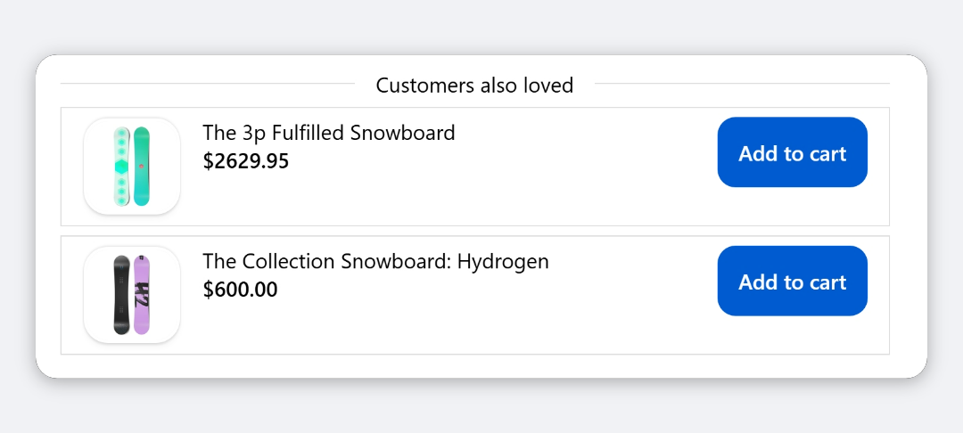
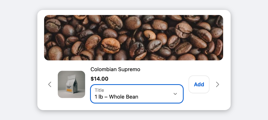
The Featured Upsell block shows one product in checkout with a large image, its price and a full-width Add button. Add the block, choose a Product Source (hand-picked products, or Shopify's related or complementary recommendations), decide what happens when the product is sold out, then save and place the block in the checkout editor.
Category
Conversion Boosters
Plan
Deluxe only
Where it shows
Shopify checkout
Setup
No code, ~5 minutes
✓ Applies to
- Deluxe plan only (not on Advanced)
- Shopify Plus checkout
- Any checkout position: body, after the header, or around the delivery address
✕ Doesn't apply to
- Showing several products at once. It always features exactly one
- Subscription (selling plan) options. Use the Upsell block for those
- Thank-you and order status pages
What the Featured Upsell block does
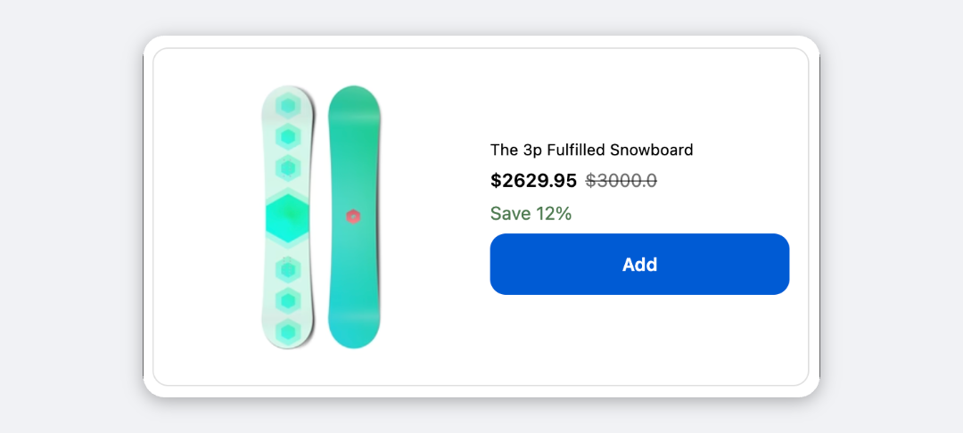
The block shows one product in a card: an optional heading and supporting line, the product image beside the title, price, savings badge and variant selector, and a full-width Add button. When the buyer clicks it, the button shows “Adding…”, then “Added”, and the product is in the order.
It never shows more than one product, and it never shows arrows or dots.
When to use it
- Push one high-margin add-on, such as a care kit or warranty-style accessory, with maximum attention.
- Run a single-product offer with a promotional image and a line like “Available 50% off for returning customers”.
- Keep an offer alive when stock runs out by listing backup products and choosing Show next available product.
Before you start
- The Deluxe plan. Featured Upsell isn’t included in Advanced. Choosing it on Advanced opens the Upgrade The Plan window.
- Products available to buyers. The featured products must be active and available on your Online Store sales channel.
- For a promotional image, have it ready to upload. The link, if you use one, must start with
https://.
Set it up
- In Checkout Ninja, go to Blocks and click Create New Block. Then click Start Fresh, or open an existing block you want to add it to.
- Click Add block and choose Featured Upsell.
- Under Product Source, keep Custom Product and select one or more products. The first available one is featured. Or choose Related Products or Complementary Products.
- Under When the product is unavailable, choose Show out-of-stock label or Show next available product.
- Under Content & Labels, type a Heading and Supporting Line if you want them.
- (Optional) Upload a Promotional Image, and set the product image, elements, price format, text style and container options.
- Click Done. Check that Status is Active, then click Save and copy the Block ID.
- Click Open Checkout Editor. Add the Custom Block app block where you want the offer, paste the Block ID and save.
If you leave Custom Product empty, the block shows nothing at checkout. It doesn’t fall back to recommendations. In the app preview it shows a reminder to choose a product.
Settings reference
Product
| Setting | What it does | Default |
|---|---|---|
| Product Source | Custom Product: the products you select, in order. Related Products / Complementary Products: Shopify’s top recommendation for the first product in the cart. | Custom Product |
| When the product is unavailable | Show out-of-stock label: features the first product even if it’s sold out, with a disabled button. Show next available product: features the first product with stock, from up to five candidates. | Show out-of-stock label |
Products already in the cart are skipped in both modes.
Content & Labels
| Setting | What it does | Default |
|---|---|---|
| Heading | Main heading above the product. Empty hides it. | Empty (hidden) |
| Supporting Line | Smaller line under the heading, for your offer hook. Empty hides it. | Empty (hidden) |
Tick Customize Labels to edit these:
| Setting | What it does | Default |
|---|---|---|
| Add Button Text | Text on the button. | Add |
| Adding Text | Shown while the product is being added. | Adding… |
| Added Text | Shown briefly after the product is added. | Added |
| Out of Stock Text | Replaces the button text when the product can’t be bought. | Sold out |
| Savings Badge Text | Start of the savings badge, for example “Save 20%”. | Save |
| Variant Selector Label | Not currently shown. Each selector is labelled with the product’s option name, such as Size. | Options |
Click Manage translations to add languages. Each language gets a card for the content and labels. Buyers see their checkout language, then the base language (fr-CA falls back to fr), then English.
Promotional Image (optional)
| Setting | What it does | Default |
|---|---|---|
| Image | Image shown above the product. Empty hides it, with no space reserved. Only https images display. | None |
| Alt Text | Describes the image for screen readers. | Empty |
| Link URL | Page the image opens when clicked. Must start with https://. Empty makes it a plain image. | Empty |
| Open link in new tab | Opens the link in a new tab. | On |
| Full-bleed (ignore padding) | Runs the image edge to edge instead of inside the container padding. | Off |
| Image Corner Radius | None, Small, Base or Large. | Base |
| Max Height | No limit, Small (120px), Medium (200px) or Large (320px). Taller images are cropped. | No limit |
Alt Text and Link URL are greyed out until you add an image.
Product Image
| Setting | Options | Default |
|---|---|---|
| Aspect Ratio | Square (1:1), Portrait (4:5), Landscape (16:9), Original | Square (1:1) |
| Image Fit | Cover (fills and crops), Contain (shows the whole image) | Cover |
| Corner Radius | None, Small, Base, Large | Base |
Elements
Each checkbox shows or hides one element. A hidden element leaves no gap.
| Setting | Default |
|---|---|
| Heading | On |
| Supporting line | On |
| Product image | On |
| Product title | On |
| Price | On |
| Compare-at price | On |
| Savings badge | On |
| Variant selector | On. Only shows for products with more than one variant. |
Price Format
| Setting | Options | Default |
|---|---|---|
| Original Price Position | Before price, After price | Before price |
| Discount Shown As | Percentage, Amount saved, Both, Hidden | Percentage |
The original price and savings badge appear only when the variant has a compare-at price above its price. Currency and decimals follow your store’s settings.
Text Style
| Setting | Options | Default |
|---|---|---|
| Heading | Small, Base, Strong, Heading | Heading |
| Supporting line | Small, Base, Strong, Heading | Small |
| Product title | Small, Base, Strong, Heading | Strong |
Container
| Setting | Options | Default |
|---|---|---|
| Background | Transparent, Base, Subdued | Transparent |
| Border | None, Base | Base |
| Corner Radius | None, Small, Base, Large | Base |
| Padding | None, Tight, Base, Loose | Base |
| Element Spacing | Tight, Base, Loose | Base |
| Text Alignment | Left, Center, Right. Applies to the product details. | Left |
Verify it worked
- Go to checkout with a cart that doesn’t contain the featured product. The card shows the product and its price.
- Click Add. The button shows “Adding…” then “Added”, and the product appears in the order summary.
- After a few seconds the card switches to the next product from the source, or disappears if there isn’t one.
- Negative check: with Show out-of-stock label, set the featured product to zero stock. The button shows Sold out and can’t be clicked.
Limitations
- Shopify Plus only for placement in the checkout steps. That’s a Shopify rule for all checkout apps.
- Only one product is ever shown. With Show next available product, the block checks the first five candidates.
- No subscription options. Products are added as one-time purchases, quantity 1, at their normal price.
- The button colour follows your checkout branding. Text sizes are limited to Shopify’s four text styles.
Troubleshooting
Nothing shows at checkout. Check that you selected at least one product under Custom Product, and that it isn’t already in the cart. For recommendations, Shopify may return nothing for the first product in the cart. See upsell products not showing.
The heading or supporting line is missing. Both start empty. Type text into Heading and Supporting Line, and check that the matching checkboxes under Elements are on.
The button shows Sold out. Every variant of the featured product is out of stock. Restock it, or switch When the product is unavailable to Show next available product and add backup products.
The promotional image doesn’t appear.
The block only displays images whose URL starts with https://. Upload the image through the Image field rather than pasting an http link, and set Max Height to No limit if the image looks cut off.
Want to see this block in a live checkout first? See examples and use cases →
Frequently asked
Why select more than one product if only one is shown? +
The extra products are fallbacks. With 'Show next available product', the block features the first product that's in stock and not already in the cart.
What happens after the buyer adds the product? +
The button shows 'Added' for about two and a half seconds. The product then drops out, because products already in the cart are never featured, and the next product from the source takes its place.
Can I add a promotional image? +
Yes. Upload an image under Promotional Image (optional). It shows above the product and can link to a page, such as a collection.
Does the heading show by default? +
Only once you type one. Heading and Supporting Line start empty, and an empty element is hidden.