How to set up the Info List block
In short
The Info List block shows an optional heading and description, then rows of short information, each with an icon, primary text, sub-text and an optional email, phone or URL link. Add the block, add rows, pick the layout (stacked, in up to three columns, or side by side), and optionally wrap it in a card border.
Category
Layout & Content
Plan
Advanced & Deluxe
Where it shows
Shopify checkout
Setup
No code, ~5 minutes
✓ Applies to
- Advanced and Deluxe plans
- Shopify Plus checkout
- Any checkout position: body, after the header, or around the delivery address
✕ Doesn't apply to
- Custom icons or hex colours. Icons and colours come from Shopify's checkout set
- Thank-you and order status pages
What the Info List block does
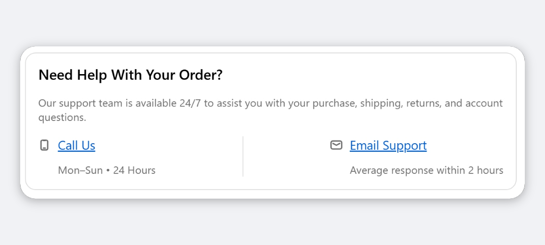
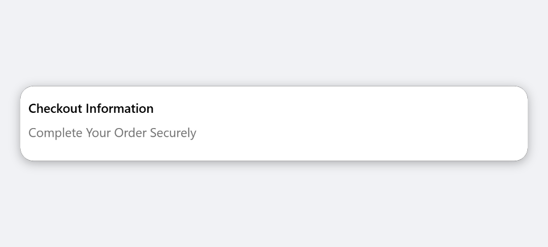
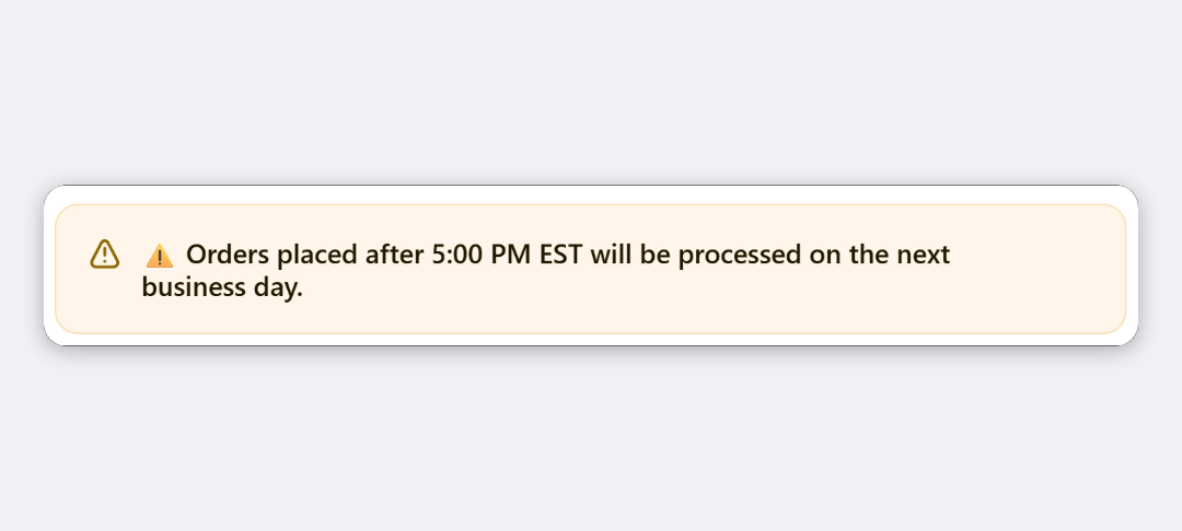
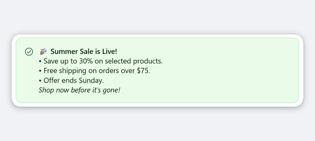
The block shows a short list in checkout: an optional heading and description, then rows. Each row can have an icon, a line of primary text, a muted line of sub-text, and a link that opens an email, dials a phone number or goes to a web page. Rows can stack, split into up to three columns, or sit side by side on one line.
When to use it
- Show support contacts, such as your support email, phone number and opening hours.
- List store facts, such as delivery time, returns window and secure payment.
- Give pickup details, such as store address and collection hours.
Before you start
- Gather the text for each row, and any email addresses, phone numbers or full URLs (with
https://) you want to link.
Set it up
- In Checkout Ninja, go to Blocks and click Create New Block. Then click Start Fresh, or open an existing block you want to add it to.
- Click Add block and choose Info List.
- (Optional) Under Content, enter a Heading and Description.
- Under Rows, click Add new item.
- Choose an Icon, replace the placeholder Primary Text, and add Sub-text if needed.
- (Optional) Choose a Link Type and enter the Link Value.
- Repeat for each row.
- Under Layout, choose a Row Direction and, for vertical layout, the number of Columns.
- (Optional) Adjust Text Style, Icon and Card Border settings.
- Click Done. Check that Status is Active, then click Save and copy the Block ID.
- Click Open Checkout Editor. Add the Custom Block app block where you want the list, paste the Block ID and save.
Settings reference
Content
| Setting | What it does | Default |
|---|---|---|
| Heading | Title above the rows. Leave empty to hide it, with no space reserved. | Empty |
| Description | Text under the heading. Leave empty to hide it. | Empty |
Rows
Each row has:
| Setting | What it does | Default |
|---|---|---|
| Icon | Leading icon: None, Email, Phone, Location, Clock, Globe, Store, Link, Info, Question, Delivery, Lock, Gift, Star, Verified, Discount or Return. | None |
| Primary Text | Main line of the row. Becomes the link when a link is set. | support@example.com |
| Sub-text | Muted line under the primary text, for example opening hours. | Empty |
| Link Type | None (plain text), Email (mailto:), Phone (tel:) or URL. | None (plain text) |
| Link Value | Email address, phone number or full URL (https://…), matching the link type. | Empty |
Layout
| Setting | What it does | Default |
|---|---|---|
| Row Direction | Vertical (stacked) puts rows on top of each other. Horizontal (inline) puts all rows side by side on one line that wraps on narrow screens. | Vertical (stacked) |
| Columns | Splits rows across 1, 2 or 3 columns. Vertical layout only. Columns wrap to one on narrow screens. | 1 column |
| Divider between columns / items | Draws a vertical line between columns, or between items in horizontal layout. | Off |
Text Style
Heading, Description, Row Primary Text and Row Sub-text each have a Style Preset and, under Advanced Options, Size, Style (Normal, Bold, Italic) and Color. The text box inside each one isn’t used; the text comes from the Content and Rows settings.
| Setting | What applies in checkout | Default |
|---|---|---|
| Heading | Always uses the checkout heading style. Italic and colours apply; size doesn’t. | Bold |
| Description | Bold, Italic, the Small and Extra Small sizes, and colours Subdued, Success, Warning and Critical. | Small, Subdued |
| Row Primary Text | Same options as Description. On linked rows, colour is dropped so the link uses your store’s link colour. | Base size, Default colour |
| Row Sub-text | Same options as Description. | Small, Subdued |
Icon
| Setting | What it does | Default |
|---|---|---|
| Icon Color | Default, Subdued, Success, Info, Warning or Critical. | Subdued |
| Icon Size | Small, Base or Large. | Small |
Card Border
| Setting | What it does | Default |
|---|---|---|
| Wrap in a card border | Puts the whole block in a bordered card. The three settings below only apply when this is on. | Off |
| Corner Radius | None, Small, Base or Large. | Base |
| Background | None, Subdued or Base. | None |
| Padding | None, Small, Base or Large. | Base |
Verify it worked
- Open your checkout. The heading, description and rows show in the layout you chose.
- Click each linked row. Email rows open a new email, phone rows offer to call, and URL rows open the page.
- Narrow the browser window or open checkout on a phone. Columns and horizontal rows wrap.
Limitations
- Shopify Plus only for placement in the checkout steps. That’s a Shopify rule for all checkout apps.
- Icons come from a fixed set, and colours are Shopify’s tones, not hex colours.
- The divider line uses your checkout’s border colour. It has no colour setting.
- The heading always renders at the checkout heading size, whatever size you choose.
Troubleshooting
A row shows as plain text instead of a link.
Check Link Type and Link Value. A phone value must contain at least one digit. A URL must start with https:// or http://. If the value doesn’t fit its type, the row shows as plain text.
A row is missing. Rows with no primary text, no sub-text and no icon are skipped. Fill in at least one.
The Columns setting is greyed out. Columns only apply to Vertical (stacked) layout. Switch Row Direction back to vertical.
The block doesn’t show. It hides itself when there’s no heading, no description and no rows with content. Then run through the general checklist.
Want to see this block in a live checkout first? See examples and use cases →
Frequently asked
How do I make a phone number tappable? +
Set the row's Link Type to Phone (tel:) and enter the number in Link Value. The primary text becomes a link that opens the buyer's dialler.
Why does my row show 'support@example.com'? +
New rows start with that placeholder as the Primary Text. Replace it with your own text.
Do columns work on mobile? +
Columns sit side by side when there's room and wrap into a single column on narrow screens.
Can I use my own icon? +
No. Choose from the built-in set, such as Email, Phone, Location, Clock and Delivery. Checkout only displays Shopify's own icons.