How to set up the Card block
In short
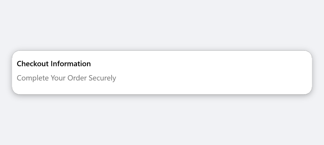
The Card Block shows a title and a short description inside a bordered card. Add a Card Block, replace the placeholder Title and Description with your own text, and choose a Background Color and Text Color. Save, then place it in the checkout editor.
Category
Layout & Content
Plan
Advanced & Deluxe
Where it shows
Shopify checkout
Setup
No code, ~5 minutes
✓ Applies to
- Advanced and Deluxe plans
- Shopify Plus checkout
- Any checkout position: body, after the header, or around the delivery address
✕ Doesn't apply to
- Images, links or buttons inside the card
- Thank-you and order status pages
What the Card Block does
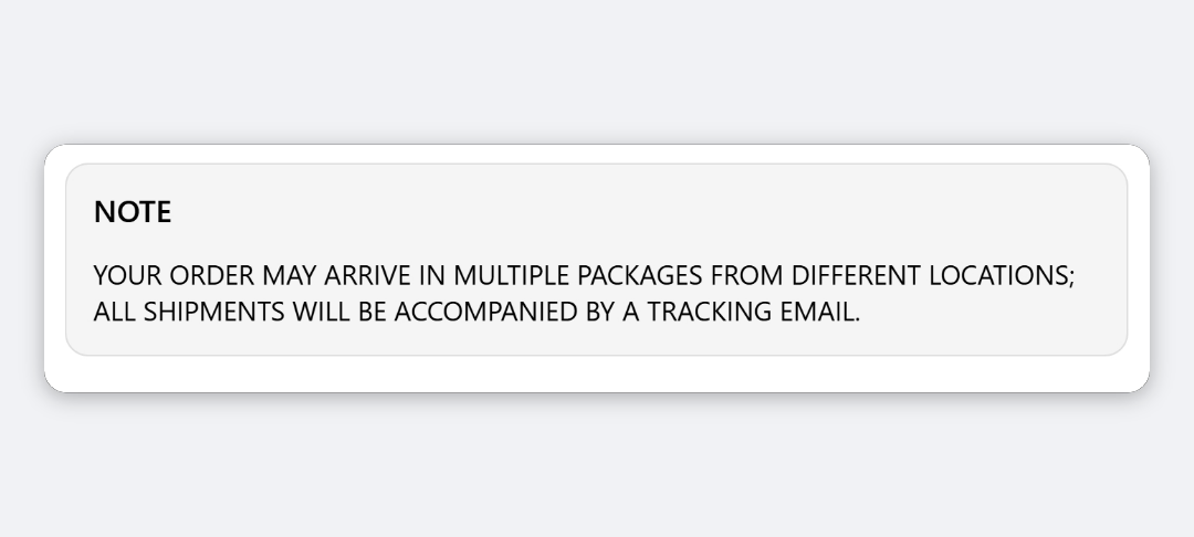
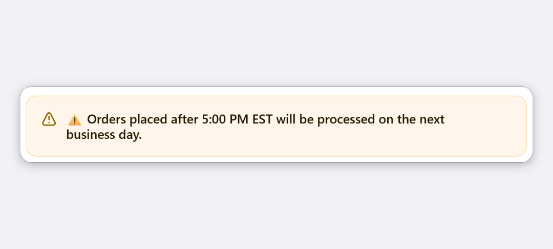
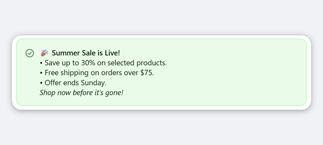
The block shows a bordered card in checkout with a title in the checkout heading style and a line of description underneath. You choose the card’s background and the colour of its text.
When to use it
- Highlight a short promise, such as “Free returns within 30 days”.
- Group a heading and a sentence in a box, so they stand out from the form fields around them.
- Show a coloured note, for example a success-green line confirming something about the order.
Before you start
- Nothing extra. The Card Block is included in both the Advanced and Deluxe plans.
Set it up
- In Checkout Ninja, go to Blocks and click Create New Block. Then click Start Fresh, or open an existing block you want to add it to.
- Click Add block and choose Card Block.
- Replace the placeholder Title with your own.
- Replace the placeholder Description with your own.
- Choose a Background Color and a Text Color.
- Click Done. Check that Status is Active, then click Save and copy the Block ID.
- Click Open Checkout Editor. Add the Custom Block app block where you want the card, paste the Block ID and save.
Settings reference
| Setting | What it does | Default |
|---|---|---|
| Title | Card heading. Leave empty to show only the description. | Card Title |
| Description | Text under the title. Leave empty to show only the title. | Card description text goes here. |
| Background Color | Light, Dark or Primary. Light and Dark use your checkout’s base and subdued backgrounds. | Light |
| Text Color | Colour of both the title and the description: Default, Subdued, Critical, Warning or Success. | Default |
Verify it worked
- Open your checkout. The card shows your title and description in a bordered box.
- Check that no placeholder text (“Card Title”) is left.
Limitations
- Shopify Plus only for placement in the checkout steps. That’s a Shopify rule for all checkout apps.
- Padding, border and corner radius are fixed. The card always has a border.
- Text Color applies to the title and description together. You can’t colour them separately.
- Colours come from your checkout branding and Shopify’s tones, not free hex colours.
- Text is processed as a Liquid template, so text wrapped in
{{ }}or{% %}is treated as code rather than shown as typed.
Troubleshooting
Buyers see “Card Title” or “Card description text goes here.” The placeholder text was saved. Open the block, replace Title and Description, and save.
The card doesn’t show. The block hides itself when both Title and Description are empty. Add text to at least one. Then run through the general checklist.
Want to see this block in a live checkout first? See examples and use cases →
Frequently asked
Why does my card say 'Card Title'? +
The Title and Description start with placeholder text. Replace both with your own copy before you save.
Can I add a link or image to the card? +
No. The card shows plain text only. For a card with a logo and a link, use the Collapsible Card block. For links in formatted text, use the Rich Text Banner block.
Can I remove the border? +
No. The Card Block always has a border. The Rich Text Banner block's Card layout lets you turn the border off.