How to set up the Reviews Gallery block
In short
The Reviews Gallery block shows up to 12 reviews you enter by hand, in one of 13 layouts such as Stacked Cards, Two Column Grid, Swipe Cards or Flip-Through Cards. Add the Reviews Gallery block, pick a Layout Arrangement, add your reviews with a rating for each, choose what to show, save, and place the block in the checkout editor.
Category
Trust & Security
Plan
Advanced & Deluxe
Where it shows
Shopify checkout
Setup
No code, ~5 minutes
✓ Applies to
- Advanced and Deluxe plans
- Shopify Plus checkout
- Any checkout position: body, after the header, or around the delivery address
✕ Doesn't apply to
- Importing reviews from Google, Trustpilot, Judge.me or other apps. You type each review in yourself
- Thank-you and order status pages
What the Reviews Gallery block does
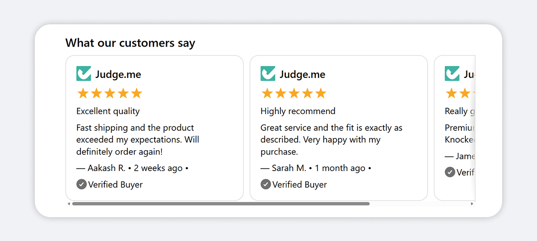
The block shows a set of customer reviews in checkout. You pick one of 13 layouts, and the same reviews re-flow into it: stacked cards, a two-column grid, a sideways-scrolling row, one card at a time with arrows, and more. Each review can show stars (with half stars), a title, text, the reviewer’s name, a date, a verified badge, and a source logo, photo or icon. You can switch each element on or off. An optional heading or logo sits above the reviews.
When to use it
- Show several reviews at the moment of payment, when buyers have their last doubts.
- Build a specific look, like a compact grid of stars and titles or photo cards, by combining a layout with the show/hide toggles.
- Show a logo wall or customer photo strip with the Photo Slider layout.
Before you start
- Copy the reviews you want to show: rating, title, text, reviewer name and date. You can add up to 12.
- Host any photos or logos at public https URLs, for example in Content → Files in your Shopify admin.
Set it up
- In Checkout Ninja, go to Blocks and click Create New Block. Then click Start Fresh, or open an existing block you want to add it to.
- Click Add block and choose Reviews Gallery.
- Under Layout, choose a Layout Arrangement. Stacked Cards is the default.
- Under Content, add a Heading Text or a Heading Image / Logo, or leave both empty.
- Under Reviews, add a review and fill in its Rating, Title, Review Text, Reviewer Name and Date. Repeat for each review.
- Under Image / Symbol, choose what fills the image slot: Source logo, Image, Icon or None. For Source logo, pick the Review Source.
- Under Elements, untick anything you don’t want to show.
- (Optional) Adjust Appearance, Container and Cards.
- Click Done. Check that Status is Active, then click Save and copy the Block ID.
- Click Open Checkout Editor. Add the Custom Block app block where you want the reviews. Paste the Block ID and save.
Always type a Rating for each review. A new review doesn’t save a rating until you enter one, and reviews without a rating show no stars.
Settings reference
Layout
| Setting | What it does | Default |
|---|---|---|
| Layout Arrangement | Stacked List, Stacked Cards, Centered, List with Dividers, Questions & Answers, Photo on Top, Photo Cards, Side by Side, Swipe Cards, Photo Slider, Two Column Grid, Compact Grid or Flip-Through Cards. | Stacked Cards |
How the layouts differ:
- Swipe Cards and Photo Slider scroll sideways.
- Flip-Through Cards shows one review at a time, with previous/next arrows and dots.
- Two Column Grid and Compact Grid fall back to one column when the checkout is too narrow.
- Questions & Answers uses each review’s title as the question and its text as the answer. It hides stars and images.
- Photo Slider shows images only. If no review has an image, it falls back to Stacked Cards.
Content
| Setting | What it does | Default |
|---|---|---|
| Heading Text | Heading above all reviews. Leave empty to hide it. | Empty |
| Heading Image / Logo | https URL of a logo or rating badge for the whole block, shown up to 240px wide. Leave empty to hide it. | Empty |
| Heading Image Shape | Original — no cropping, Wide (16:9) — photos, Banner (4:1) — wordmark logos or Square (1:1). The fixed shapes leave blank space if your image doesn’t match. | Original — no cropping |
| Header Alignment | Left, Center or Right, for the heading text and image only. | Left |
Reviews (per review, up to 12)
| Setting | What it does |
|---|---|
| Rating (0–5, decimals ok) | Star rating. Decimals show as part-filled stars, so 4.5 shows four and a half. 0 or blank hides the stars. |
| Title | Review headline. |
| Review Text | The review body (up to 3 lines in the editor). |
| Reviewer Name | Shown after a dash, for example — Sarah K. |
| Date | Free text, such as 2 weeks ago. |
| Image URL | https URL of an avatar, product shot or customer photo. Used when Image / Symbol is Image. |
| Icon | Icon for this review. Used when Image / Symbol is Icon. |
| Show Verified Badge | Shows the verified icon and label on this review. Off for new reviews. |
| Verified Badge Label | Text beside the verified icon. The editor suggests Verified review. |
Image / Symbol
| Setting | What it does | Default |
|---|---|---|
| Show image / symbol | Turns the image slot on or off for every review. | On |
| Image / Symbol | Source logo (Trustpilot, Google…) shows the source’s logo and label above each review. Image (avatar, product or photo) uses each review’s Image URL. Icon uses each review’s Icon. None shows nothing. | Source logo |
| Review Source | (Source logo) Google, Trustpilot, Yotpo, Judge.me or Reviews.io. Sets the logo, the default label, and the brand star colour. | Trustpilot |
| Source Label | (Source logo) Text beside the logo. Leave empty to use the source’s name, such as Google Reviews. | Empty |
| Image Fit | (Source logo or Image) Contain (whole image) or Cover (fill and crop). | Cover |
| Icon Colour | (Icon) Neutral (default), Success (green), Warning (amber) or Critical (red). | Neutral |
| Image Vertical Alignment | (Source logo or Image) Top, Middle or Bottom, for layouts that put the image beside the text. | Top |
Elements
| Setting | What it does | Default |
|---|---|---|
| Stars | Shows each review’s stars. | On |
| Title | Shows each review’s title. | On |
| Review text | Shows each review’s text. | On |
| Reviewer name | Shows the reviewer’s name. | On |
| Date | Shows the date. | On |
| Verified badge | Shows the verified badge on reviews where Show Verified Badge is ticked. | On |
| Collapse long reviews | Cuts review text after 150 characters, with a Read more link. | Off |
Appearance
| Setting | What it does | Default |
|---|---|---|
| Star Style | Brand colour uses the review source’s colour. For Trustpilot, it uses Trustpilot’s own star graphic. Token colour uses your checkout’s colours. | Brand colour |
| Star Colour | (Token colour) Warning (amber), Success (green), Critical (red) or Neutral. | Warning (amber) |
| Verified Icon | Check, Check Circle or Profile. | Check Circle |
| Verified Colour | Default, Subdued, Success (green), Warning (amber) or Critical (red). | Success (green) |
| Title Style / Title Colour | Small, Normal, Bold or Italic, and a colour from the same list as Verified Colour. | Bold / Default |
| Review Text Style / Review Text Colour | Same options, for the review text. | Normal / Default |
| Name / Date Style / Name / Date Colour | Same options, for the name and date. The style also applies to the verified label. | Small / Subdued |
| Separator | Character between name, date and verified badge: Dot •, Hyphen –, Slash /, Pipe or None. | Dot |
Container
| Setting | What it does | Default |
|---|---|---|
| Text Alignment | Left, Center or Right, for the reviews. | Left |
| Background | None, Subdued or Base. | None |
| Padding | None, Small, Base or Large. | None |
| Spacing | Gap between the heading and reviews, and between reviews: Tight, Base or Loose. | Base |
| Container Border | Draws a border around the whole block. | Off |
| Container Corner Radius | None, Small, Base or Large. | None |
Cards
These apply to layouts that draw cards: Stacked Cards, Photo Cards, Swipe Cards, Two Column Grid, Compact Grid and Flip-Through Cards. The list layouts ignore them.
| Setting | What it does | Default |
|---|---|---|
| Card Background | None, Subdued or Base. | Base |
| Corner Radius | None, Small, Base or Large. | Base |
| Card Padding | None, Small, Base or Large. | Base |
| Card Border | Draws a border around each card. | On |
Verify it worked
- Open your checkout with any product in the cart. The heading and reviews show in the layout you chose.
- Check each review shows its stars. A review without stars has no Rating saved.
- For Swipe Cards or Flip-Through Cards, scroll or click through to the last review.
- Untick Date under Elements, save and reload. The dates should disappear from every review.
Limitations
- Shopify Plus only for placement in the checkout steps. That’s a Shopify rule for all checkout apps.
- Reviews are entered by hand. The block doesn’t connect to any review platform.
- Up to 12 reviews per block.
- Colours come from Shopify’s checkout tones, not free hex colours. Brand colour stars are the only exception.
- Bold and Italic can’t be combined on the same text. That’s a Shopify checkout limit.
- The Read more and Show less links are in English.
- Swipe Cards has no snap-to-card, because Shopify’s checkout components don’t support it.
Troubleshooting
The block doesn’t show in checkout. The block hides itself when the Reviews list is empty. Add at least one review, then run through the general checklist.
Stars are missing on some reviews. Open each review and enter a Rating above 0. Also check Stars is ticked under Elements, and that the layout isn’t Questions & Answers, which hides stars.
Photo Slider shows cards instead of photos. Set Image / Symbol to Image, keep Show image / symbol ticked, and add an https Image URL to each review. With no images, the layout falls back to Stacked Cards.
Images or logos don’t show.
Image URLs must start with https://. Check each one opens in a browser and points straight to an image file.
Want to see this block in a live checkout first? See examples and use cases →
Frequently asked
Does Reviews Gallery pull reviews from my review app? +
No. You enter each review's rating, title, text, name and date in the block. The Review Source setting only picks which logo and label to show.
Why don't the stars show? +
Stars only show for reviews with a Rating above 0. A new review starts without a rating saved, so type the rating into each review, for example 5 or 4.5.
What's the difference between Reviews Gallery and Review Card? +
Reviews Gallery lays out many reviews at once in 13 arrangements, with every element toggleable. Review Card shows one review at a time in a single card, with a platform logo and a carousel.
Can I show a logo wall or photo strip? +
Yes. Choose the Photo Slider layout, set Image / Symbol to Image, and give each review an Image URL. Only the images are shown, in a row that scrolls sideways.