How to set up the Tooltip Bar block
In short
The Tooltip Bar block shows short items, such as Easy Returns or Free Delivery, in one compact line. Each item can have an icon, and an information icon that buyers tap to open a tooltip with more detail and an optional link. Add the block, add items, then set the separator, alignment and spacing.
Category
Layout & Content
Plan
Advanced & Deluxe
Where it shows
Shopify checkout
Setup
No code, ~5 minutes
✓ Applies to
- Advanced and Deluxe plans
- Shopify Plus checkout
- Any checkout position: body, after the header, or around the delivery address
✕ Doesn't apply to
- Hover tooltips. Checkout only supports tap or click
- Thank-you and order status pages
What the Tooltip Bar block does
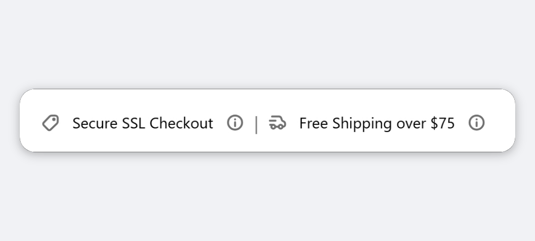
The block shows a compact line of short items in checkout, separated by dots or pipes, for example Easy Returns • Free Delivery • Secure Checkout. Each item can have a leading icon. If you add tooltip text, an information icon appears after the label, and buyers tap or click it to open a small popover with the detail and an optional link.
When to use it
- Show key selling points in one line without taking much space.
- Explain terms on demand, such as what “Easy Returns” covers, with a link to the full policy.
- Add a row of trust icons with short labels.
Before you start
- Write a short label for each item, and any tooltip text and full URLs (with
https://) you want to include.
Set it up
- In Checkout Ninja, go to Blocks and click Create New Block. Then click Start Fresh, or open an existing block you want to add it to.
- Click Add block and choose Tooltip Bar.
- Under Bar Items, click Add new item.
- Choose an Icon and replace the placeholder Label.
- (Optional) Add Tooltip Text. To add a link inside the tooltip, fill in Tooltip Link Label and Tooltip Link URL.
- Repeat for each item.
- Under Layout, choose the Separator, Alignment and Spacing.
- (Optional) Under Style, adjust Label Text, Icon Color and Separator Color.
- Click Done. Check that Status is Active, then click Save and copy the Block ID.
- Click Open Checkout Editor. Add the Custom Block app block where you want the bar, paste the Block ID and save.
Settings reference
Bar Items
Each item has:
| Setting | What it does | Default |
|---|---|---|
| Icon | Leading icon: None, Info, Question, Check, Shield / Secure, Delivery, Discount, Lock, Gift, Star or Receipt. | None |
| Label | Short text shown in the bar. | Easy Returns |
| Tooltip Text | Detail shown when the buyer taps the information icon. Leave empty to hide the icon. | Empty |
| Tooltip Link Label | Link text inside the tooltip, for example “See full terms”. | Empty |
| Tooltip Link URL | Where the tooltip link goes. Must start with https:// or http://. | Empty |
Layout
| Setting | What it does | Default |
|---|---|---|
| Separator | Character between items: Dot ( • ), Pipe ( | ) or None. | Dot ( • ) |
| Alignment | Left, Center, Right, or Space between (spreads items edge to edge, best with Separator: None). | Center |
| Spacing | Gap between items: Tight, Small, Base, Loose or Extra loose. Has little effect with Space between. | Small |
Style
| Setting | What it does | Default |
|---|---|---|
| Label Text | Style Preset, plus Size, Style and Color under Advanced Options. Bold, Italic, the Small size and colours Subdued, Success, Warning and Critical apply in checkout. Larger sizes render at the default size. The text box inside isn’t used. | Small |
| Icon Color | Colour of item icons: Default, Subdued, Success, Info, Warning or Critical. | Subdued |
| Separator Color | Default or Subdued. | Subdued |
Verify it worked
- Open your checkout. The items show in one line with your separators.
- Tap or click an information icon. The tooltip opens with your text and link.
- Open checkout on a phone. The bar wraps onto more lines if needed.
Limitations
- Shopify Plus only for placement in the checkout steps. That’s a Shopify rule for all checkout apps.
- Tooltips open on tap or click only, not on hover. That’s a Shopify checkout limit.
- Icons come from a fixed set, and colours are Shopify’s tones, not hex colours.
- Labels can’t be larger than body text.
Troubleshooting
The information icon doesn’t appear. It only shows when Tooltip Text has text. Fill it in for that item.
The link inside the tooltip is missing.
It needs both Tooltip Link Label and Tooltip Link URL, and the URL must start with https:// or http://.
The bar doesn’t show. Items with no label, no icon and no tooltip text are skipped, and the block hides when no items are left. Then run through the general checklist.
Want to see this block in a live checkout first? See examples and use cases →
Frequently asked
Do tooltips open on hover? +
No. Shopify checkout only lets apps open popovers on tap or click, so buyers tap or click the information icon. This works the same on mobile and desktop.
How do I hide the information icon on an item? +
Leave that item's Tooltip Text empty. The icon only shows when there's tooltip text.
Can an item be just an icon? +
Yes. An item shows if it has a label, an icon or tooltip text, so you can build a row of icons.
What happens on small screens? +
The bar wraps onto more lines when the items don't fit on one.