How to set up the Notice Banner block
In short
The Notice Banner block shows a coloured status banner with a heading, a description and up to two link buttons. Add the block, pick a Quick Template or set the Tone, Heading and Description yourself, and optionally add button text and URLs. Save, then place it in the checkout editor.
Category
Layout & Content
Plan
Advanced & Deluxe
Where it shows
Shopify checkout
Setup
No code, ~5 minutes
✓ Applies to
- Advanced and Deluxe plans
- Shopify Plus checkout
- Any checkout position: body, after the header, or around the delivery address
✕ Doesn't apply to
- Blocking checkout. A Critical banner is a message only; use a checkout rule to stop checkout
- Thank-you and order status pages
What the Notice Banner block does
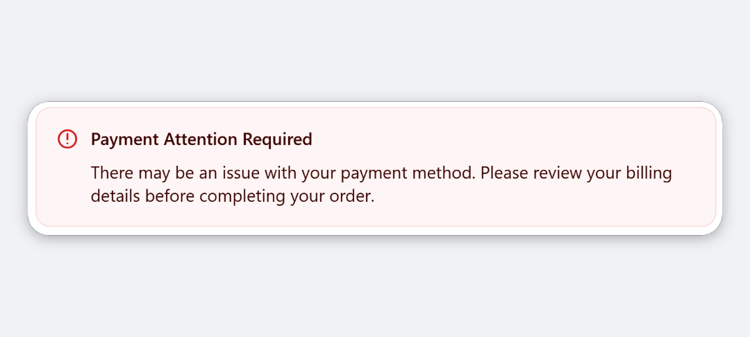
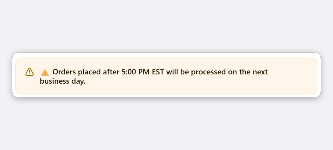
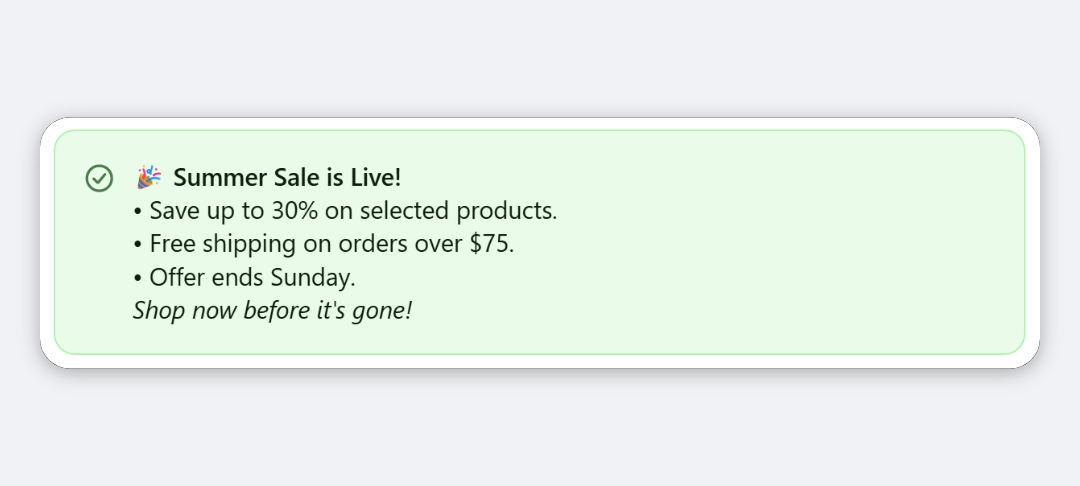
The block shows a Shopify status banner in checkout. The Tone sets its colour and icon. Inside, it shows your Heading, a Description, and up to two buttons that link to pages such as your shipping policy or FAQ.
When to use it
- Warn about delays or cutoffs, such as carrier delays or a holiday order deadline.
- Point buyers to more detail, with a button to your delivery or returns page.
- Flag stock or payment notes, such as items on backorder.
Before you start
- If you want buttons, have the full URLs ready, including
https://.
Set it up
- In Checkout Ninja, go to Blocks and click Create New Block. Then click Start Fresh, or open an existing block you want to add it to.
- Click Add block and choose Notice Banner.
- (Optional) Under Quick Templates, click a template to pre-fill the banner. Do this first, because it replaces the tone, heading and description.
- Under Content, choose a Tone and edit the Heading and Description.
- (Optional) Under Buttons, fill in Primary Button Text and Primary Button URL. Add a secondary button the same way.
- Click Done. Check that Status is Active, then click Save and copy the Block ID.
- Click Open Checkout Editor. Add the Custom Block app block where you want the banner, paste the Block ID and save.
Show a delay notice only for affected countries: turn on Enable conditional block visibility and add a country condition. See every condition.
Settings reference
Quick Templates
Each template fills in the tone, heading and description, and clears the button fields. You can edit everything afterwards.
| Template | Tone | Heading |
|---|---|---|
| Carrier Delay | Warning | Shipping Delay Notice |
| Promo / Sale | Info | Limited Time Sale |
| Free Shipping | Success | You’ve Unlocked Free Shipping! |
| Out of Stock | Warning | Item on Backorder |
| Payment Issue | Critical | Payment Attention Required |
| Store Notice | Info | Holiday Cutoff Notice |
Content
| Setting | What it does | Default |
|---|---|---|
| Tone | Banner colour and icon: Info (Blue), Success (Green), Warning (Orange) or Critical (Red). | Info (Blue) |
| Heading | Title of the banner. Leave empty to hide it. | Important Notice |
| Description | Body text under the heading. Leave empty to hide it. | Empty |
Buttons
| Setting | What it does | Default |
|---|---|---|
| Primary Button Text | Label of the main button. Leave empty to hide the button. | Empty |
| Primary Button URL | Where the main button links. Must start with https:// or http://. | Empty |
| Secondary Button Text | Label of the second button. Leave empty to hide it. | Empty |
| Secondary Button URL | Where the second button links. Must start with https:// or http://. | Empty |
Verify it worked
- Open your checkout. The banner shows in the tone you chose, with your heading and description.
- Click each button and check it opens the right page.
- If you set visibility conditions, open a checkout that doesn’t match them. The banner doesn’t show.
Limitations
- Shopify Plus only for placement in the checkout steps. That’s a Shopify rule for all checkout apps.
- Colours come from Shopify’s banner styles and your checkout branding. You can’t set custom colours.
- Heading and description are plain text. Buttons are the only links.
- Any link on checkout can take the buyer away from paying. Keep buttons for information that matters.
- Text is processed as a Liquid template, so text wrapped in
{{ }}or{% %}is treated as code rather than shown as typed.
Troubleshooting
The banner doesn’t show. Check that Heading or Description has text. The block hides itself when both are empty. Then run through the general checklist.
A button is missing.
The button needs both its text and its URL, and the URL must start with https:// or http://. www.example.com on its own isn’t accepted.
My buttons disappeared after I picked a template. Templates clear all four button fields. Re-enter the button text and URLs after picking a template.
Want to see this block in a live checkout first? See examples and use cases →
Frequently asked
Why doesn't my button show? +
A button needs both its text and a URL that starts with https:// or http://. If either is missing, or the URL has no protocol, the button is hidden.
Does picking a template overwrite what I wrote? +
Yes. A template replaces the Tone, Heading and Description, and clears all four button fields. Pick the template first, then edit.
Can I use it without a heading? +
Yes. Leave Heading empty and only the description shows. The block hides only when both are empty.
How is this different from the Message block? +
The Message block shows a single short message in a banner. Notice Banner adds a separate heading and description, up to two buttons, and quick templates.