How to set up the Rich Text Banner block
In short
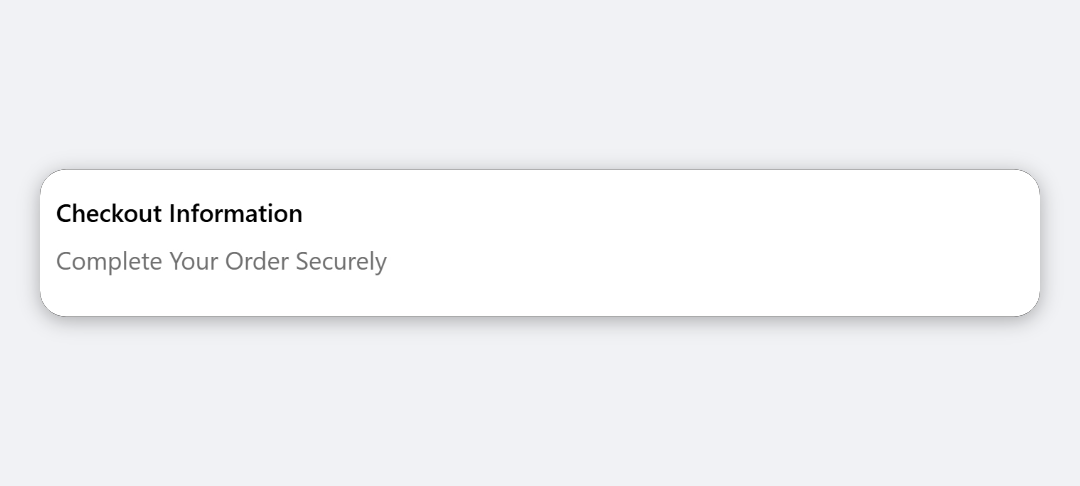
The Rich Text Banner block shows formatted text, with headings, lists, bold, italic and links, inside a status banner or a plain card. Add the block, write your text in the Content editor, then choose a Layout Style: Banner with a colour, or Card with your own background, padding, border and corners.
Category
Layout & Content
Plan
Advanced & Deluxe
Where it shows
Shopify checkout
Setup
No code, ~5 minutes
✓ Applies to
- Advanced and Deluxe plans
- Shopify Plus checkout
- Any checkout position: body, after the header, or around the delivery address
✕ Doesn't apply to
- Images or buttons inside the text. Use the Image or Notice Banner block
- Thank-you and order status pages
What the Rich Text Banner block does
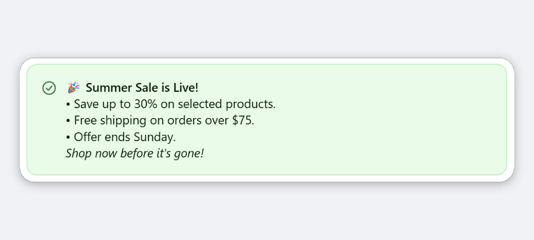
The block shows text you format in an editor, such as headings, bold and italic text, lists and links, in the checkout. You choose how it’s framed: as a Shopify status banner in one of four colours, or as a neutral card.
When to use it
- Explain a policy in a few lines, such as returns or delivery times, with a list of key points.
- Link to a page such as your shipping FAQ or size guide.
- Announce an offer or change with a heading and a short paragraph.
Before you start
- Have your text ready. Content is required, and the block doesn’t save without it.
Set it up
- In Checkout Ninja, go to Blocks and click Create New Block. Then click Start Fresh, or open an existing block you want to add it to.
- Click Add block and choose Rich Text Banner.
- Write your text in Content. Use the toolbar for headings, bold, italic, lists, alignment and links.
- Under Layout Style, choose Banner or Card.
- For Banner, pick a Banner Style.
- For Card, set Background Color, Padding, Show Border and Corner Radius.
- Click Done. Check that Status is Active, then click Save and copy the Block ID.
- Click Open Checkout Editor. Add the Custom Block app block where you want the text, paste the Block ID and save.
Settings reference
Content
| Setting | What it does | Default |
|---|---|---|
| Content | Formatted text: headings (H1 to H3), bold, italic, numbered and bulleted lists, alignment and links. Required. | Empty |
| Layout Style | Banner (status banner with colour coding) or Card (neutral card). | Banner |
Banner layout
| Setting | What it does | Default |
|---|---|---|
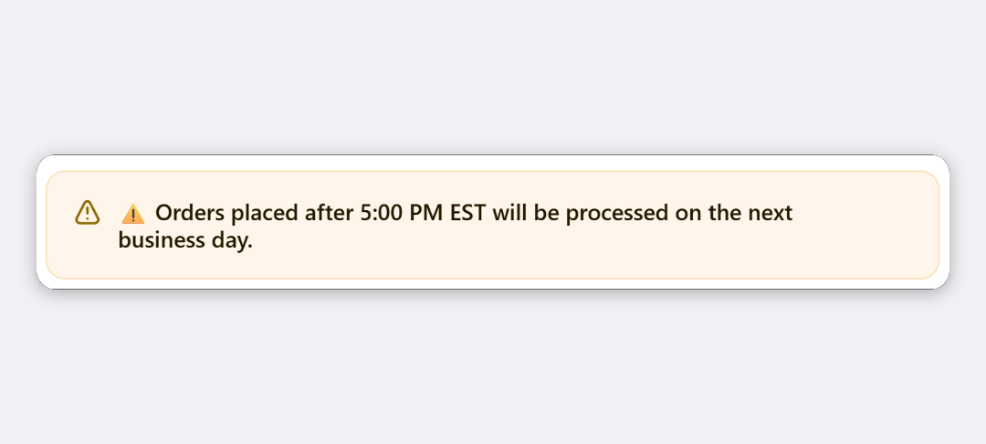
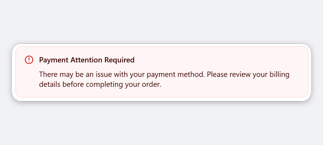
| Banner Style | Colour and icon: Info (Blue), Success (Green), Warning (Yellow) or Critical (Red). | Info (Blue) |
Card layout
| Setting | What it does | Default |
|---|---|---|
| Background Color | Transparent, Base or Subdued. | Base |
| Padding | Space inside the card: None, Small, Base or Large. | Base |
| Show Border | Draws a border around the card. | On |
| Corner Radius | None, Base or Large. | Base |
Verify it worked
- Open your checkout. Your text shows with its formatting, inside a banner or card.
- Click each link to check it goes to the right page.
Limitations
- Shopify Plus only for placement in the checkout steps. That’s a Shopify rule for all checkout apps.
- All heading levels render at the same size, because checkout gives apps one heading style.
- Text that’s both bold and italic shows as bold only.
- No images, buttons, underline or text colours. Colours come from Shopify’s banner styles and your checkout branding.
Troubleshooting
The block doesn’t show in checkout. Check that Content has text. The block hides itself when the editor is empty. Then run through the general checklist.
A list item that starts with a number loses it. To avoid double numbering, the block removes a number from the start of every list item, in numbered and bulleted lists alike, for example “2-day delivery” shows as “-day delivery”. Reword the item so it doesn’t start with a number, such as “Delivery in 2 days”.
Justified text doesn’t look justified in checkout. Checkout supports left, centre and right alignment only. Pick one of those in the editor.
Want to see this block in a live checkout first? See examples and use cases →
Frequently asked
What formatting can I use? +
Headings, bold, italic, numbered and bulleted lists, links, and left, centre or right alignment. The editor offers exactly what checkout can display.
What's the difference between Banner and Card layout? +
Banner shows the text in a Shopify status banner with a colour and icon (Info, Success, Warning or Critical). Card shows it in a neutral box where you choose the background, padding, border and corner radius.
Why do my H1, H2 and H3 headings look the same? +
Shopify's checkout components have one heading style for apps, so every heading level renders at the same size.
Can I add a button? +
Not in this block, but links work. For banner buttons, use the Notice Banner block.