How to set up the Collapsible Card block
In short
The Collapsible Card block shows a bordered card with an optional logo and a heading that buyers click to reveal a description and link. Add the block, enter a Heading (required), add a Description and optional Link Label and URL, and choose whether it starts expanded. Save, then place it in the checkout editor.
Category
Layout & Content
Plan
Advanced & Deluxe
Where it shows
Shopify checkout
Setup
No code, ~5 minutes
✓ Applies to
- Advanced and Deluxe plans
- Shopify Plus checkout
- Any checkout position: body, after the header, or around the delivery address
✕ Doesn't apply to
- Several expandable sections in one list. Use the Accordion block
- Thank-you and order status pages
What the Collapsible Card block does
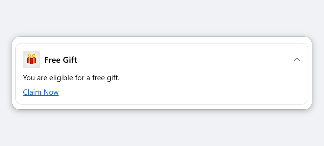
The block shows a bordered card with an optional logo and a heading. When the card is collapsible, a chevron sits on the right and buyers click the heading to show or hide the description and link. It suits short announcements such as loyalty points, membership perks or a note about delivery.
When to use it
- Promote a loyalty or membership scheme, with your programme’s logo and a “Learn more” link.
- Keep details out of the way but available, such as delivery terms or a returns summary.
- Show a branded announcement with a logo next to the heading.
Before you start
- (Optional) Upload your logo to Shopify Files, or have it ready to upload from the app’s file browser.
- For a link, have the full URL ready, including
https://.
Set it up
- In Checkout Ninja, go to Blocks and click Create New Block. Then click Start Fresh, or open an existing block you want to add it to.
- Click Add block and choose Collapsible Card.
- (Optional) Under Logo / Image (optional), click Open File Browser, pick or upload an image, and click Done. Then choose a Logo Size.
- Enter the Heading. It’s required.
- Enter the Description buyers see when the card is expanded.
- (Optional) Add a Link Label, for example “Learn more”, and its Link URL.
- Set Collapsible (show chevron toggle) and Start expanded to choose how the card opens.
- (Optional) Adjust the card styling and text styles.
- Click Done. Check that Status is Active, then click Save and copy the Block ID.
- Click Open Checkout Editor. Add the Custom Block app block where you want the card, paste the Block ID and save.
Settings reference
Content
| Setting | What it does | Default |
|---|---|---|
| Logo / Image (optional) | Image shown to the left of the heading. Leave blank to show the heading only. | None |
| Logo Size | Small (24 px), Base (32 px) or Large (48 px). | Base (32 px) |
| Heading | Card title, always visible. Required. | Empty |
| Description | Text shown when the card is expanded. Leave blank to hide it. | Empty |
| Link Label | Link text shown under the description, for example “Learn more”. | Empty |
| Link URL | Where the link goes. Must start with https:// or http://. | Empty |
Layout and behaviour
| Setting | What it does | Default |
|---|---|---|
| Content Alignment | Aligns the description and link: Left, Center or Right. The heading row isn’t affected. | Left |
| Collapsible (show chevron toggle) | Buyers can click the heading to open and close the card. When off, the card is always expanded with no toggle. | On |
| Start expanded | Whether a collapsible card starts open. | On |
Card styling
| Setting | What it does | Default |
|---|---|---|
| Card Padding | Space inside the card: None, Extra Tight, Tight, Base, Loose or Extra Loose. | Base |
| Corner Radius | None, Small, Base or Large. | Base |
| Border Width | None or Base. | Base |
| Background | Transparent, Base or Subdued. | Transparent |
Text styling
Heading Style and Description Style each have a Style Preset and, under Advanced Options, Size, Style (Normal, Bold, Italic) and Color. Each also shows a Text box, which the card doesn’t use: the text always comes from Heading and Description above.
| Setting | What applies in checkout | Default |
|---|---|---|
| Heading Style | The heading always uses the checkout heading style. Italic and colours Subdued, Success, Warning and Critical apply. Size and Accent don’t. | Bold |
| Description Style | Bold, Italic, the Small and Extra Small sizes, and colours Subdued, Success, Warning and Critical apply. Larger sizes and Accent don’t. | Base size |
| Link Color | Colour of the link in the app’s preview only. In checkout, links use your store’s accent colour. | Accent (Blue) |
| Chevron Color | Colour of the toggle chevron: Default, Subdued, Accent (Blue), Success (Green), Info, Warning or Critical (Red). Accent shows as Info blue, and Default looks the same as Subdued. | Subdued |
Verify it worked
- Open your checkout. The card shows your logo and heading.
- Click the heading. The description and link show or hide, and the chevron flips.
- Click the link and check it opens the right page.
Limitations
- Shopify Plus only for placement in the checkout steps. That’s a Shopify rule for all checkout apps.
- The card opens again in its Start expanded state each time checkout loads. It doesn’t remember what the buyer did.
- Colours come from your checkout branding and Shopify’s tones, not free hex colours.
- Text is processed as a Liquid template, so text wrapped in
{{ }}or{% %}is treated as code rather than shown as typed.
Troubleshooting
The logo doesn’t show.
The logo URL must start with https://. Images picked from the file browser meet this. If you pasted an address some other way, check it.
The link doesn’t show.
It needs both Link Label and Link URL, and the URL must start with https:// or http://. It also only shows while the card is expanded.
The heading text I typed under Heading Style doesn’t appear. The Text box inside Heading Style isn’t used. Type the heading in the Heading field under Content.
The whole card doesn’t show. The block hides itself when there’s no heading, description or logo. Then run through the general checklist.
Want to see this block in a live checkout first? See examples and use cases →
Frequently asked
Can the card stay open all the time? +
Yes. Turn off Collapsible (show chevron toggle). The card is always expanded and has no toggle.
Can the card start closed? +
Yes. Keep Collapsible on and turn off Start expanded. Buyers see the heading and click it to reveal the description.
Why doesn't the Link Color setting change the link in checkout? +
Links in checkout always use your store's accent colour from checkout branding. Link Color only affects the preview in the app.
What size should the logo be? +
Choose Small (24 px), Base (32 px) or Large (48 px) under Logo Size. A square image works best.